Work · Commercial
Shizin Spa
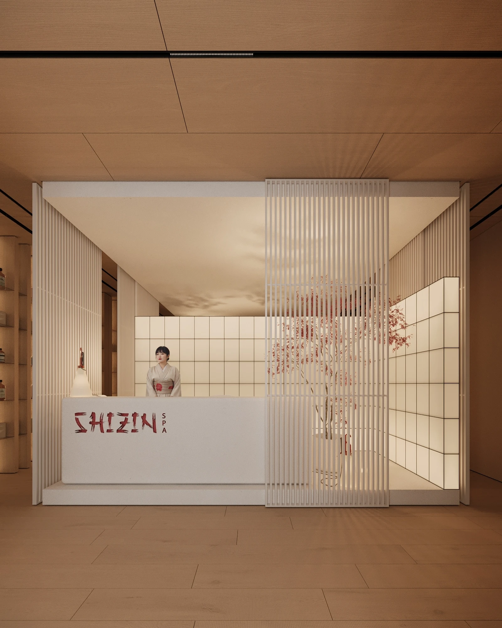
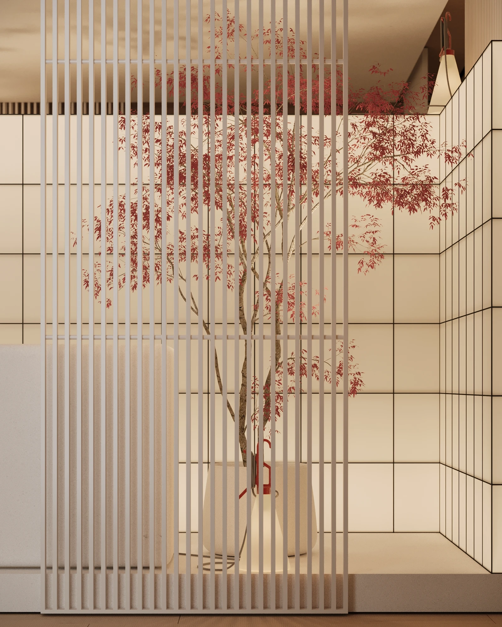
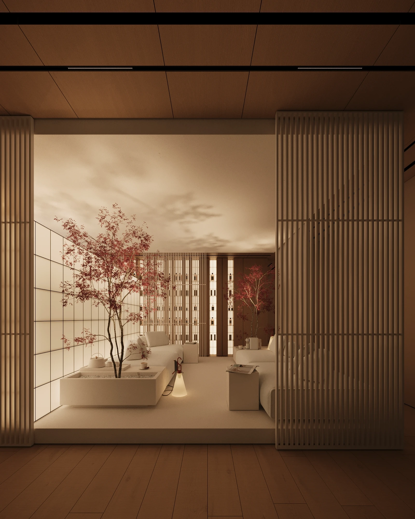
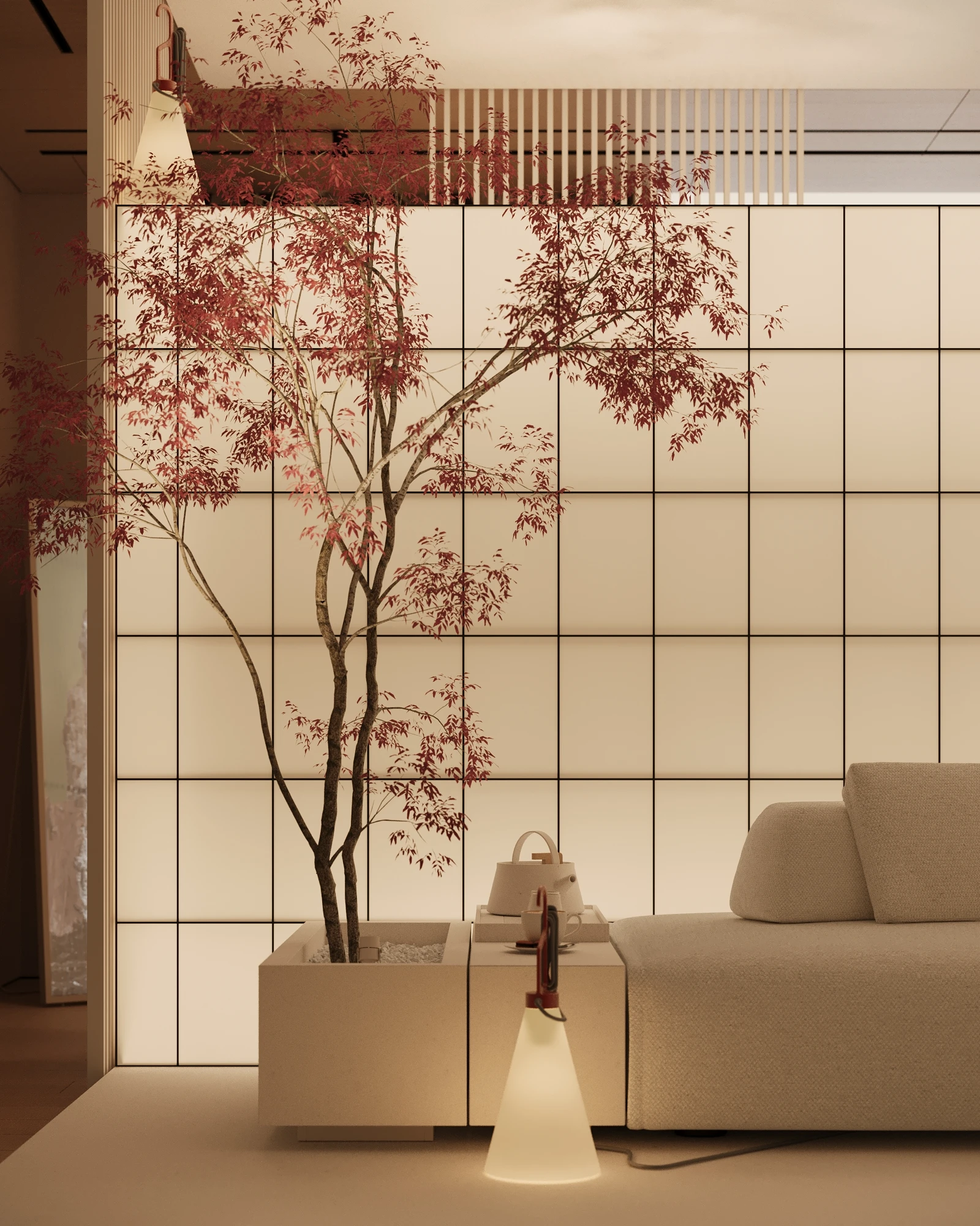
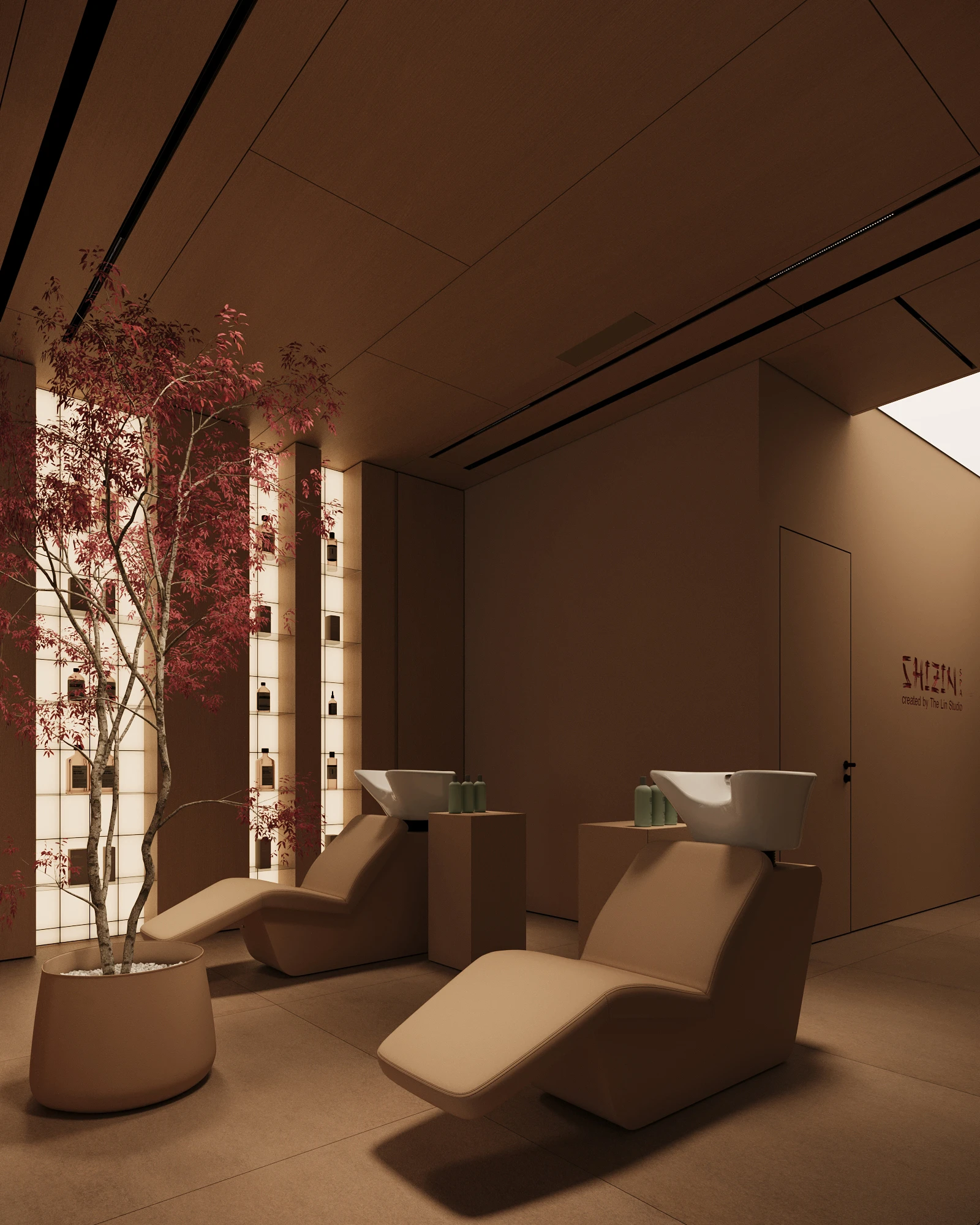
A Japanese spa: calligraphy, rice paper, red maple, and the silence of a tea ceremony.
Scope
- Interior concept
- Spatial branding
- Materials
- Working drawings
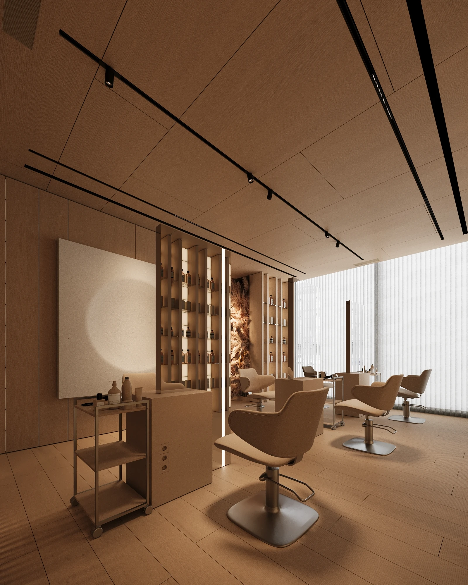
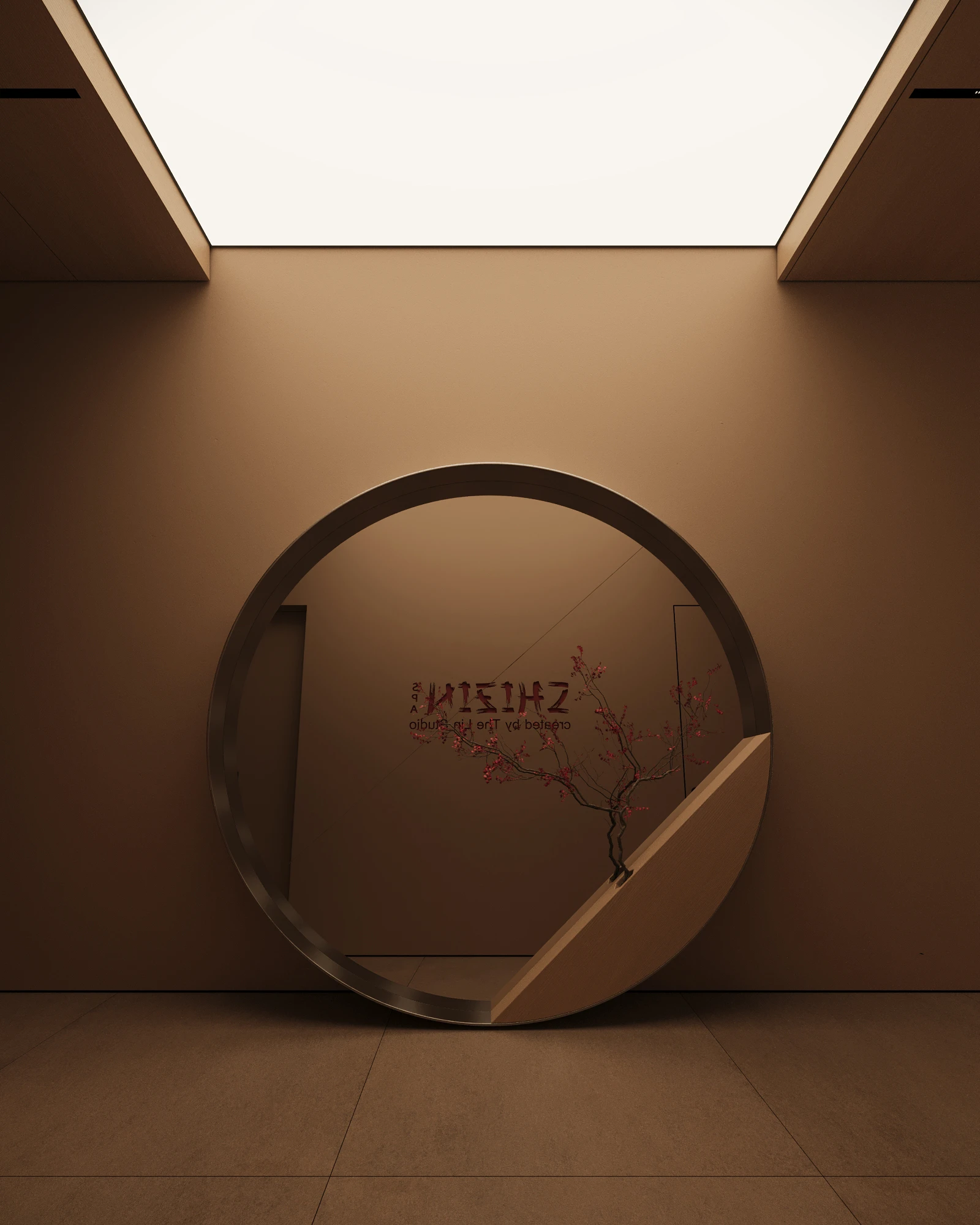
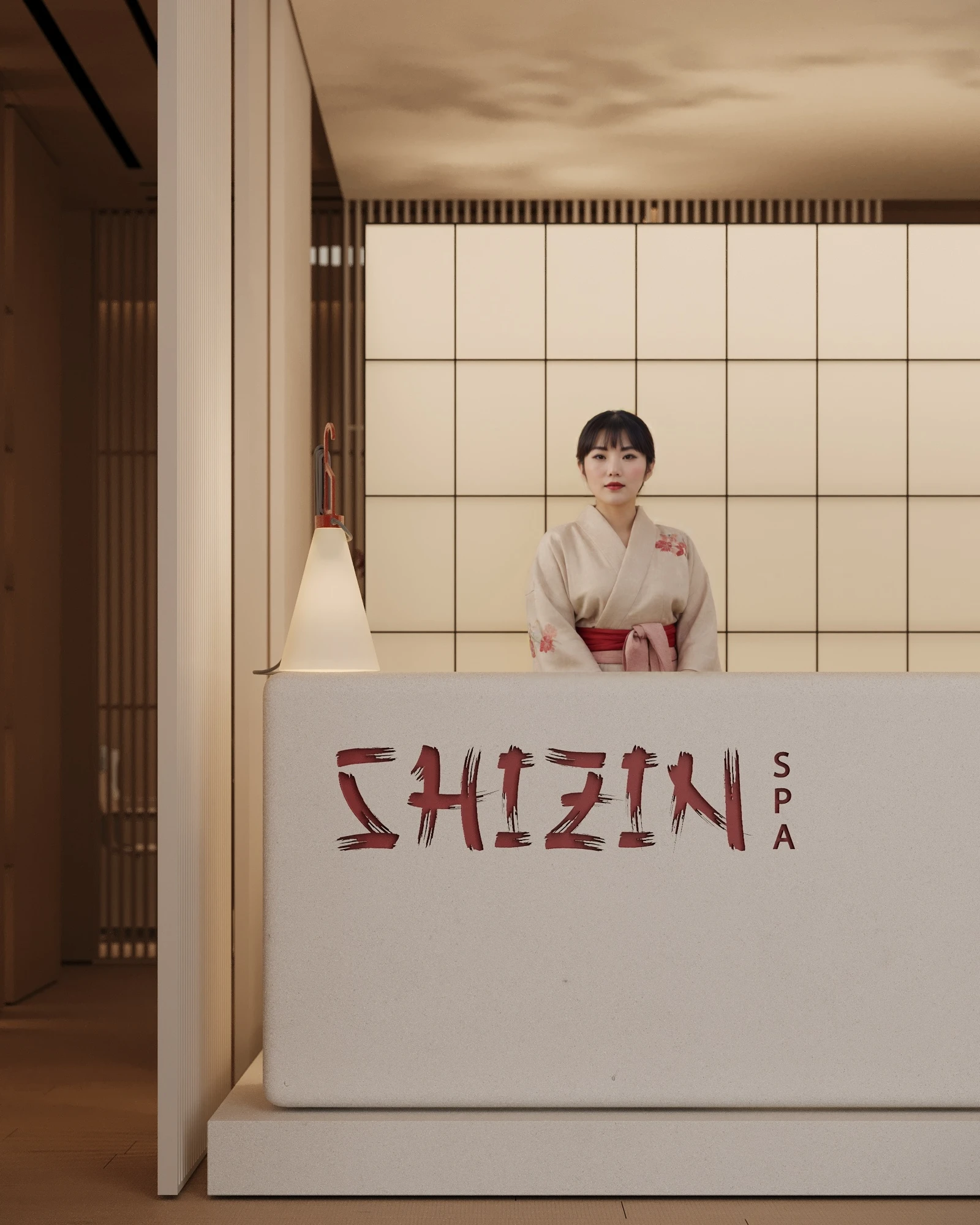
A spa with a Japanese character. The calligraphic “Shizin” wordmark (自然 — “nature”) is brush-stroked across a white reception, and the host meets the guest in a traditional kimono.
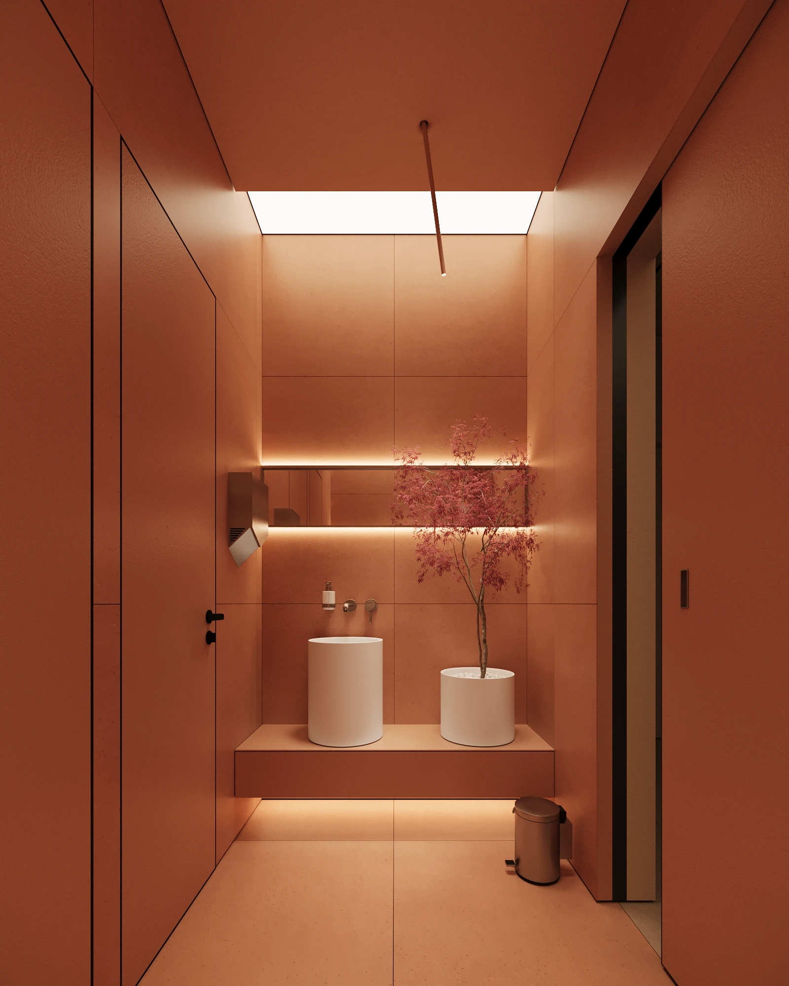
Shoji partitions of vertical slats, rice-paper “snow windows” with a delicate grid, a red Japanese maple at the heart of the waiting room — none of this is a decorative gesture. It is the structural language: zoning, the rhythm of the screens, material, light. From the entry to the treatment rooms, one tea-ceremony tempo runs throughout.